Infographic: How Centered Logos Reduce Your Site’s Usability Level
Site’s usability level has always been closely associated with most common used and implemented design methods. Once users are well accustomed to a certain specific standard, changing it simply means creating confusion and goes against a set of common user expectations, hence reduces how “friendly” a site would be.
A case study was done by Kathryn Whitenton for Nielsen Norman Group on this subject, focusing on one of most common users’ expectations on today’s websites’ standards. She used logo placements as the basis of this case study and the results, although within a limited set of participats, gives us essential insights on how conforming to basic users’ expectations helps greatly in creating a user friendly website.
Great results which all of us can utilize in order to improve your web usability level which in return get you happy customers with lower bounce rates.
Going back to homepage is
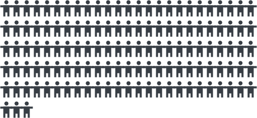
6X Harder
when the logo is
Centered
compared when it’s in the
Top left corner
A case study by Kathryn Whitenton for Nielsen Norman Group.
Case study #1
Navigate to the site’s homepage in one click.

14 sites
8 Centered Logos &
6 left-aligned logos.
Clickable image logos with no text links.

- Left logos 4%
- Centered logos 24%
% of users who failed to navigate to homepage in one click.
*The lower the better.
Participants

2 tasks
add product to cart &
navigate back to homepage.
UserZoom was used.
Study Findings
6x likeliness to fail when logos are centered.

Case study #2
Centered logos and brand recall.

4 boutique
hotel websites
Each site with 2 versions.
Left-aligned logo & centered logo.
Sites with right-aligned logos were added in.
- Left-aligned 37%
- Center-aligned 13%
Hotel Site #1
- Left-aligned 28%
- Center-aligned 21%
Hotel Site #3
- Left-aligned 41%
- Center-aligned 36%
Hotel Site #2
- Left-aligned 38%
- Center-aligned 47%
Hotel Site #4
*The higher the better.
Participants


5 random sites
were shown to each participant.
10 different sites were shown
for a brand recall test.
Study Findings
Brands with left logos were recalled more frequently, but the effect was not statistically significant.
Other factors that affect brand recall
Contrast – Padding – Legibility

Conclusion
Left-aligned > Right-aligned > Center-aligned

Critical design feature
Position your logo on the left for better results.

Expectation
Left-aligned logo for better web usability, based on common users’ expectations.

Best Result
Left-aligned logo and a “Home” text navigational link.
Read the full and original article
Centered Logos Hurt Website Navigation
a case study by Kathryn Whitenton for Nielsen Norman Group
a case study by Kathryn Whitenton for Nielsen Norman Group

